Hershey Law -
Website Redesign

Platform:
WordPress Website
Industry:
Law
Location:
California, United States
Duration:
October 2022 - December 2022
Role:

Summary

Project Overview

Hershey Law wanted to have a website built that was modern & more efficient website than their original website. The previous website included “too many 2D illustrations”, low quality images displaying their practice areas, and an outdated feel that did not match the branding of the firm. Hershey Law wanted a design that would be appealing, high functioning, and would ultimately require less time to maintain. They also wanted the site to feel quick and snappy, while also creating a pleasing user experience.

Before image Browser

Research

Understanding our users

For this project I conducted interviews with 14 different participants in person and online.  Along with creating user persona’s to accurately gauge what practices would be most effective in this design. The participants ranged in age from 32-55 years old. I also viewed websites of successful law firms in their surrounding area to see what they may have in common.

User Interviews

Most notable questions

Through interviewing the participants, I was able to gain valuable insights to identify key areas for improvement to enhance the law firm’s website and user experience. The most alarming pattern was that the users were not able to easily navigate the website and understand the services which were offered. This meant that their current website was failing in providing it’s target audience a concise experience needed to convert potential clients.

whiteboard fun

Organizing the Insights

Through interviewing the participants, I was able to gain valuable insights to identify key areas for improvement to enhance the law firm’s website and user experience. The most alarming pattern was that the users were not able to easily navigate the website and understand the services which were offered. This meant that their current website was failing in providing it’s target audience a concise experience needed to convert potential clients.

Competitive analysis

Understanding our competition

I conducted a competitive analysis on three successful law firms that compete within the general area of the law firm I was designing for. These analyses provided us the ability to form effective strategies in designing a frictionless experience for users. By studying the strengths and weaknesses of these websites, I was able to understand what elements resonated with visitors and what aspects might hinder their experience. This in-depth examination proved invaluable in shaping our approach to designing a user-centered website for the law firm.

Project Goals & Challenges

01.

Remove 2D illustrations along with low quality images to give a more personal feel to the website.

The first thing that was mentioned by both client and interviewees, was that the 2d illustrations were outdated and didn’t fit well with the brands new aesthetic direction. By removing and replacing them with high quality images that evoke emotions. We can deliver a richer and more immersive user experience that creates a sense of trust and credibility.

02.

Create a clear customer journey that harmonizes with the UX of the website.

Creating a clear customer journey that harmonizes with the user experience (UX) of the website is paramount for a successful online business. From the moment a potential client lands on the website, they should be guided step-by-step towards their desired goal, that being booking a consultation for one of the following services they  provide.

03.

Iterate a balanced website that accomplishes businesses goals while remaining inclusive to their target audience.

By gathering valuable user feedback, conducting usability tests, and analyzing data, they can identify pain points and areas of improvement to create a seamless and accessible online experience. Ensuring that the content is relevant, engaging, and resonates with the intended audience, while also aligning with the company’s strategic objectives.

Home Page Mockup V1

Listed below are the key elements I chose to highlight about this design:

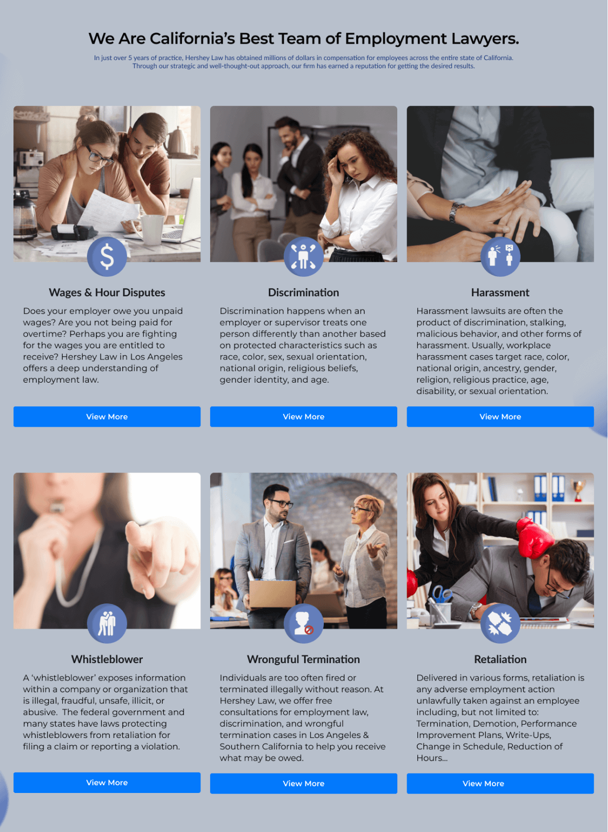
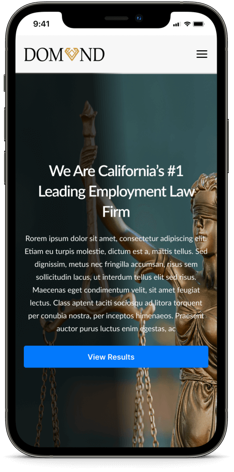
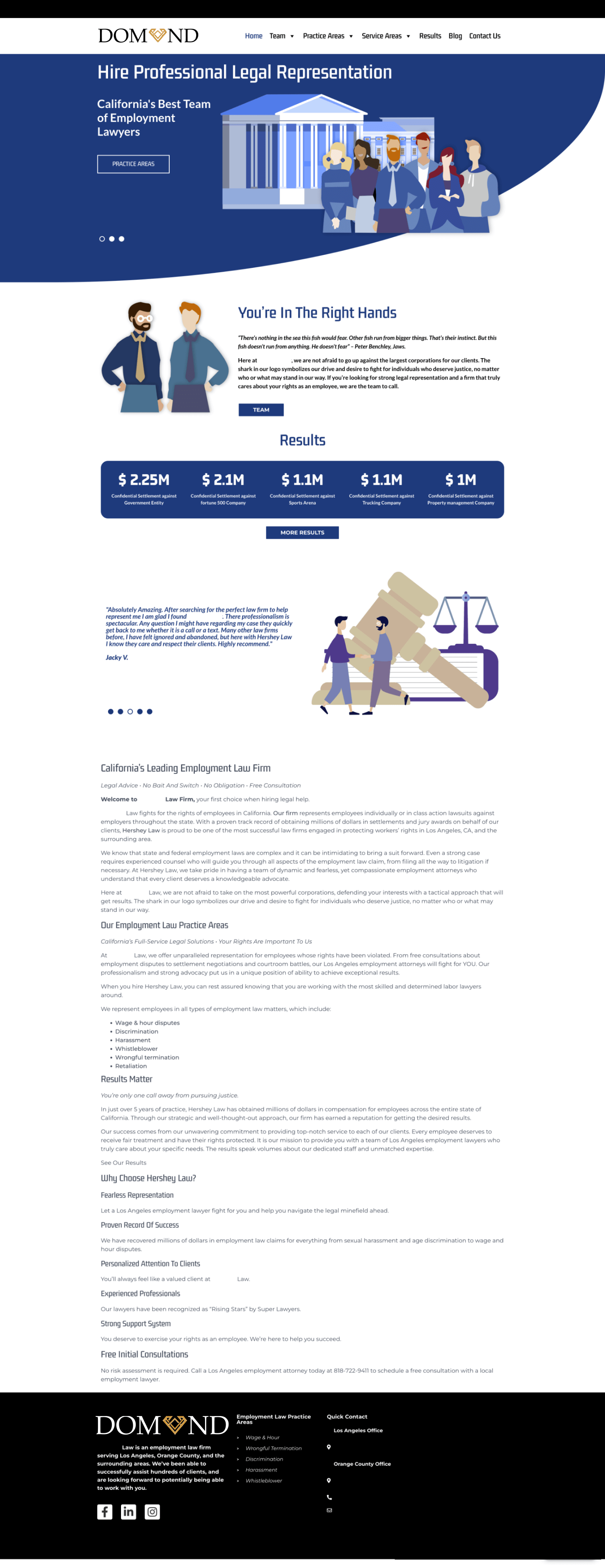
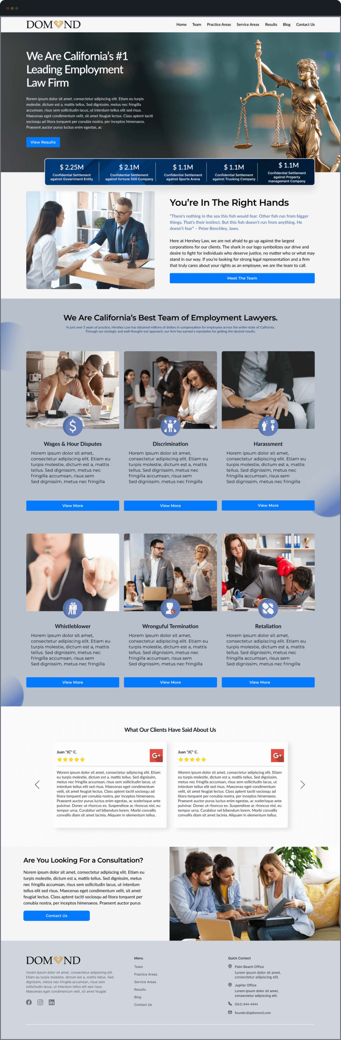
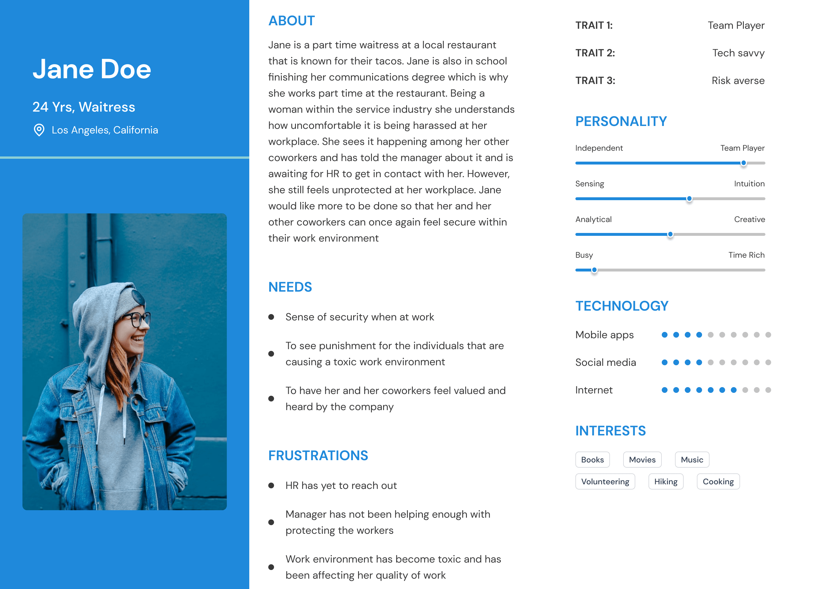
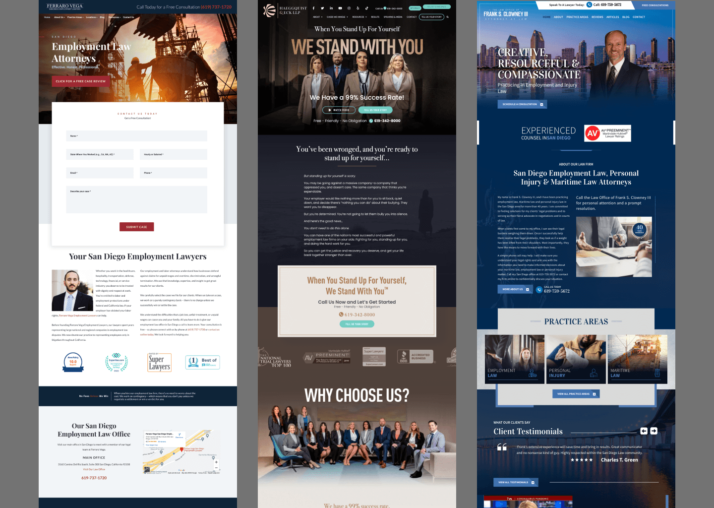
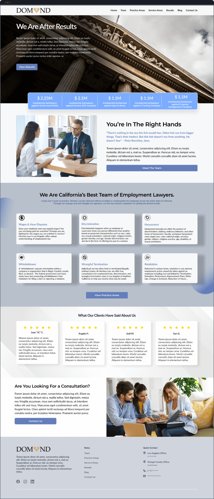
With a strategically reimagined user experience, visitors now embark on an intuitive journey that seamlessly guides them towards the information they seek. Streamlined navigation, clearly labeled sections for legal services, attorney profiles, and case studies ensure that clients can effortlessly explore the firm’s expertise.

The evolution of the website’s interface from 2D illustrations to captivating imagery and persuasive copy has been a significant stride towards an enriched user experience. This transition was driven by a strategic vision to engage visitors on a more personal level. By infusing the design with compelling imagery that resonates with the firm’s ethos, I transformed the static visuals into dynamic narratives that convey expertise and credibility.

The CTA buttons were placed to mimic the titles of the sections. I tailored each section to only provide a glimpse of important information to cause users to expand onto other parts of the website that relate best to them. This was so they may complete the ultimate goal of “Scheduling for a free consultation”. 

Back to the drawing board

Usability Problems V1

Utilizing Hotjar and in-person surveys I was able to track what participants were engaging with the most. Along with view the problems they may have in the case that they found the page to be difficult to navigate or complete the ultimate goal. Through the testing I discovered that the users found that the sections from “Your in the right hands” to “What our clients have said about us” was too lengthy without any visual cues. Making the content difficult to focus on and less impactful to users. 

Mockup V2/Final

After reviewing the data from Hotjar and the answers from in-person surveys. I made the necessary revisions listed below:

Through a comprehensive reevaluation of user interactions, I restructured the site’s layout and navigation. The implementation of intuitive menu structures and clear categorization of legal services has made it easier for clients to swiftly locate relevant information.

After 30 days, I was able to obtain some analytical data from their Hotjar account and Google Analytics account. The findings I concluded were that bounce rate decreased by 44%, user retention on pages increased by an average of 31%, and conversion rates from the new website launch averaged at 32%.

Now this section was the one that caused for the drop within engagement and was honestly intimidating for users. By adding images and utilizing a different layout approach I was able to increase engagement within this section, and decrease the bounce rate. With this revised layout users were now continuing the customer journey. 

Color Style

Hershey Blue

Hershey Grey

Hershey White

Typography

Montserrat A/reg

Aa Bb Cc Dd Ee Ff Gg

Hh Ii Jj Kk Ll Mm Nn

Button Style

Default State 

Hover State

Pressed State