During this project, I was engaged as a key contributor, collaborating closely with a team of 2 skilled UX designers and 2 adept UX researchers. Our collective objective was to conceive and shape an intuitive website catering to the educational needs of infants and toddlers. The website we designed not only hosts a large range of educational courses but also features dedicated user portals tailored for teachers, homeschooling facilitators, and parents. These portals serve as indispensable tools, empowering educators and parents alike to efficiently organize their respective courses and lesson plans.
Key Activities
01.
Collaborating with 2 UX designers and 2 UX researchers.
02.
Understanding the pain points of users and the required goals of the business.
03.
Analyzing the provided UX research from user interviews and hotjar frames.
04.
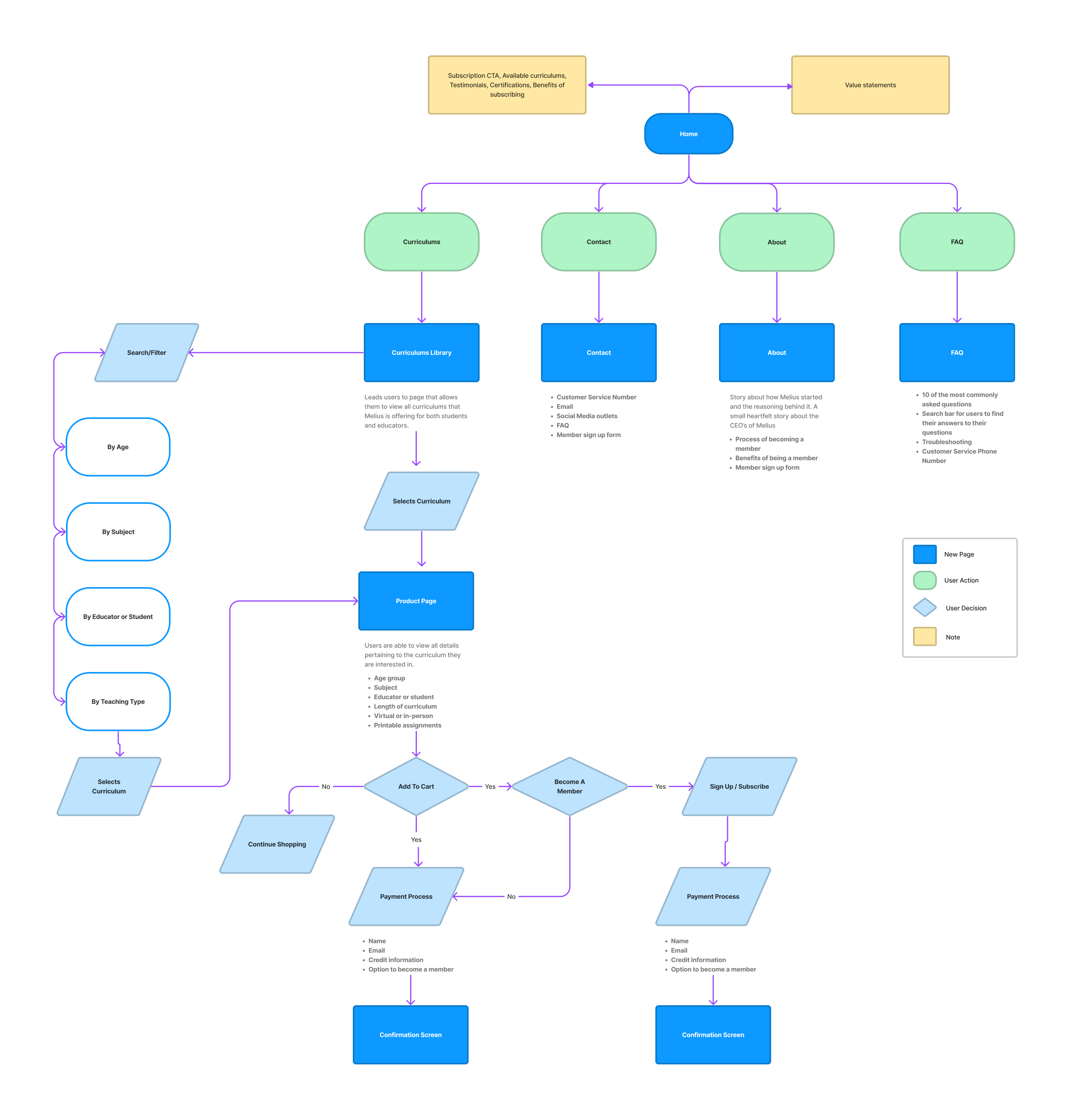
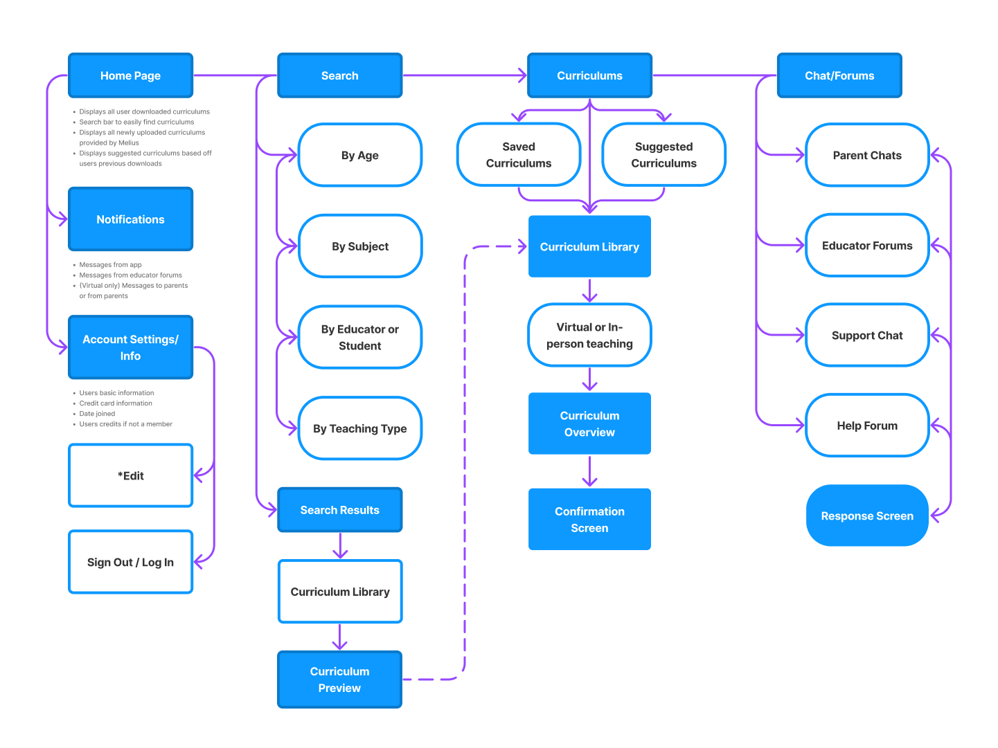
Collaborating with developers to create a clear and concise website architecture to support user portals and consumer static pages.
05.
Working within an established UX design system to establish cohesiveness.
06.
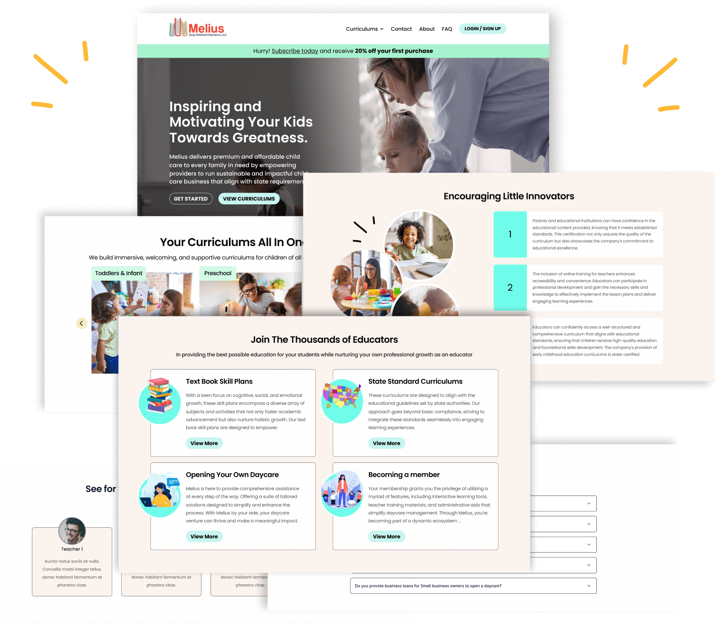
Moving designs from lo-fi wireframes into refined responsive designs.
07.
Creating prototypes and annotating design frames for handoff to development team.
Research Summary
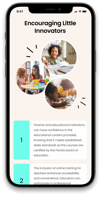
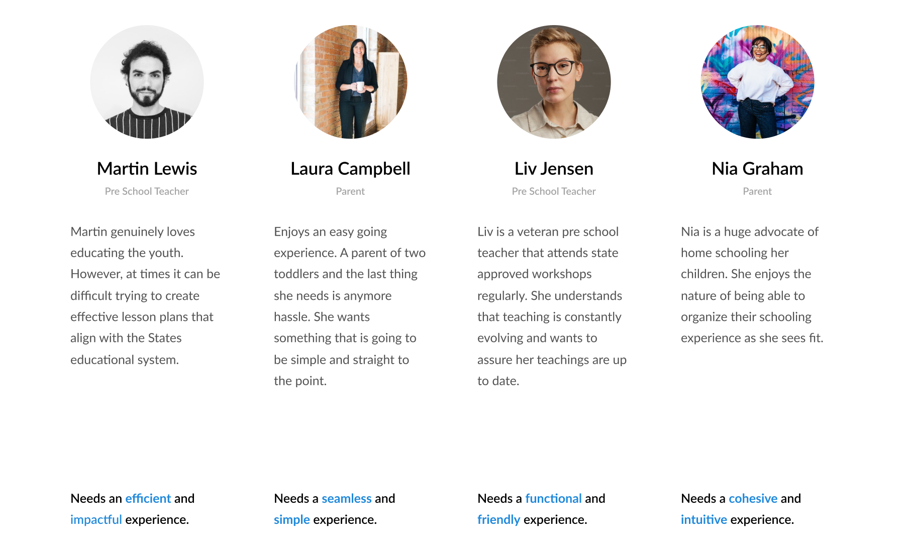
The UX research team carried out online interviews with a diverse group of 16 participants and engaged in discovery calls with the two key stakeholders at Melius. The age of the participants spanned from 27 to 60 years, while the stakeholders’ ages ranged from 34 to 42. Leveraging the insights gleaned from these interactions, the UX research team formulated four comprehensive user personas that effectively synthesized the challenges and needs articulated by both user groups and stakeholders. In collaboration with myself and the two UX designers, we devised illustrative flowcharts that served as a visual aid, aiding developers and stakeholders in comprehending and aligning with the optimal user journeys.
User Pain Points
Educators spend a lot of time researching and verifying courses that align with guiding toddlers to getting ready for grade school
Educators have to create their own lesson plans and guides for student learning
Educators must inconveniently travel to state approved workshops to continue bettering their teaching methods.
Educators who utilize similar digital products as this, find that they are not immediately user friendly and difficult to navigate.
Competitive Analysis
Certifications and awards on home page increases brand trust and credibility
Offering courses around all subjects leads to higher conversions
Less is more. Being attentive with the choice of imagery, copy, and color schemes helps with users feeling less overwhelmed when navigating the web pages.
Detailing the potential users
Incorporating the insights gathered from the interviews and discovery calls, the team structured four personas that closely resonate with the potential users.
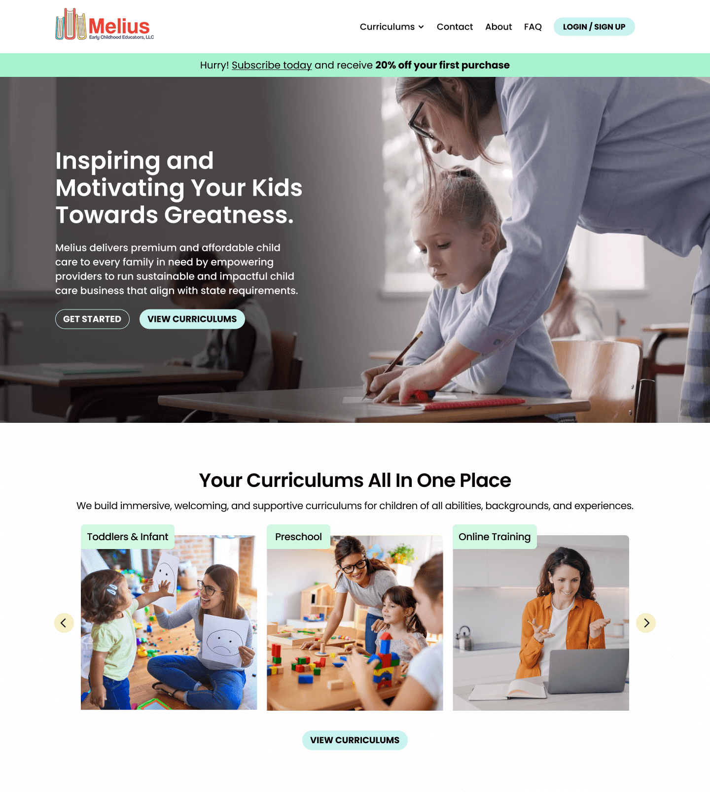
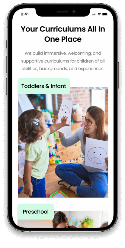
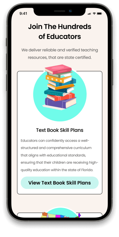
Project Goals & Challenges
01.
Designing and structuring an immediate user friendly website for both static and user portals.
Our focus was on conceptualizing and implementing an instantly accessible and user-friendly website. By prioritizing intuitive navigation and clear information architecture, we aimed to ensure that visitors could effortlessly engage with the content and features. Our approach extended beyond aesthetics, encompassing the strategic arrangement of elements to cater to diverse user needs and preferences.
02.
Creating a seamless and simple user experience that both educators and parents can navigate.
By employing user-centric design principles, we aimed to foster an environment where educators and parents can effortlessly engage with the website’s features, fostering a harmonious educational journey for the young learners under their guidance.
03.
Implementing compelling visuals and copy that retain users attention and increase user conversions.
Our copy was designed to not only inform but also entice users to take action. Through a harmonious fusion of visuals and copy, our intent was to establish a compelling narrative that guides users seamlessly from initial engagement to meaningful interactions, ultimately bolstering the rate of user conversions and creating a lasting connection between users and the platform’s offerings.
Building a solution
In order to provide a comprehensive solution, my team and I devised distinct user flows for both registered members and logged-out guests, showcasing the tailored experiences for each group. For logged-in educators, the user flow was crafted to ensure smooth navigation and engagement, seamlessly guiding them through course selection, lesson planning, and other vital interactions. On the other hand, for logged-out potential members, their user flow focused on captivating their interest through informative visuals and concise copy, encouraging them to explore further and ultimately convert to registered users.
Logged out / Guest user flow
Logged in / Member user flow
Project is still under construction
As we diligently work on refining our designs and prototypes, our primary aim is to create an exceptional digital product that educators and parents can rely on. We are committed to ensuring that every aspect of our platform contributes to an amazing user experience, one that not only meets but exceeds expectations. By investing our efforts in crafting a seamless and intuitive interface, we aspire to establish a digital tool that becomes educators’ and parents’ preferred choice, fostering a strong connection and consistently enriching their educational journey.